
Gotchies Website Design
Challenge
Designed a website for a new brand company.
Opportunity
Created a digital experience that showcases the brand’s health mission, enhances credibility, and helps it stand out in a competitive market.
Responsibilites
Tools
User Interface Design
UX Research
Custom Branding
Interaction
Figma
Canva
Jira
Team
Timeline
Lansdowne Technology Consulting
Aug - Sep 2024
Overview
As one of my first real-world freelancing projects, the goal was to create a modern, trustworthy website that communicates the brand’s mission while guiding customers toward confident purchasing decisions. This case study highlights both my approach to UX/UI design and my commitment to supporting sustainability-focused brands.
The Process

Understand the Business
Competitor Analysis
User Surveys
User Persona
User Journey
Style Guide
Sketching
Mid-fidelity Wireframe
Testing
Final Designs
Feedback from Client
UI for Launch
Ideations
Research

Reflection
A Lasting Impact
Conclusion
RESEARCHUnderstand the Business
Goal:
To provide people with the context, encouragement, and product to achieve a healthier lifestyle
Page Requirements:
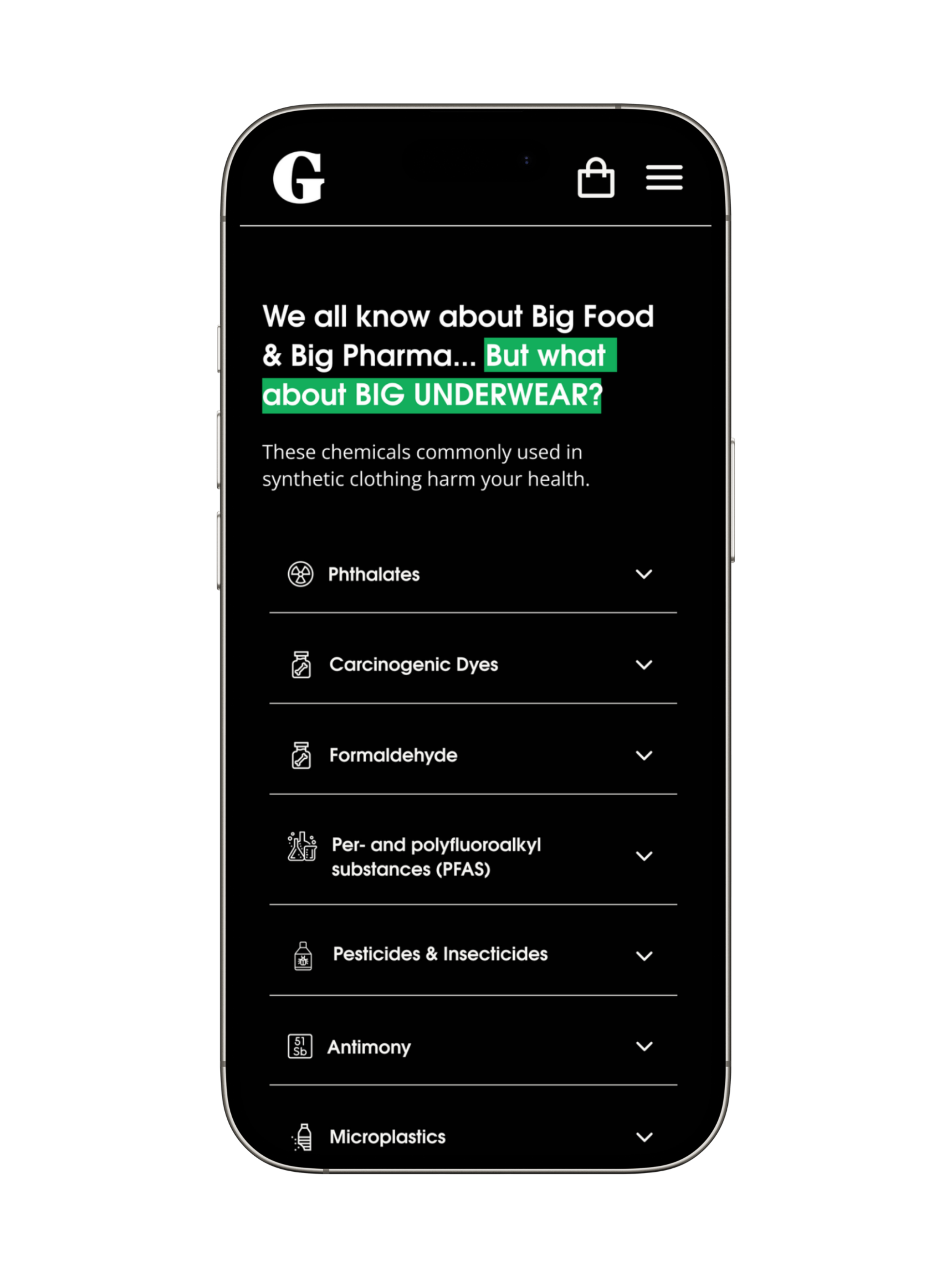
Home
Education
About Us
Company Mission::
Masculine, simple, informative, and eco-friendly theme
Competitor Analysis
The stakeholder informed me that their main competitor was NADS, an organic underwear brand, so I began my UX research by analyzing their website in the sustainable underwear market. This helps me better understand the landscape, target users, and the opportunity for differentiation.
After visiting the NADS’s website, I mapped the competitor into a red/green (pros/cons) system to quickly identify what was missing in their user experience.
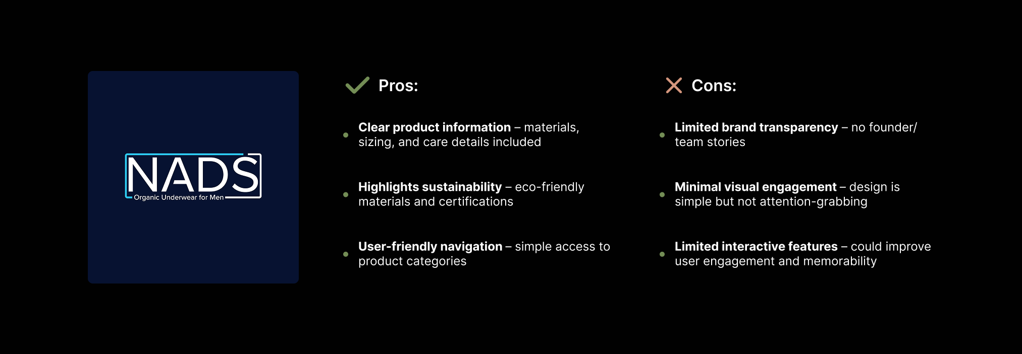
This provided a clear direction to create a website for Gotchies that feels more engaging, transparent, and trust-driven, while still maintaining simplicity and informativeness
Survey Research
To better understand the target audience and to further validate design decisions, I created an online user survey consisting of 10 questions and takes approximately 5 minutes to complete. These questions focus on shopping behaviors, values, and expectations when purchasing underwear online.
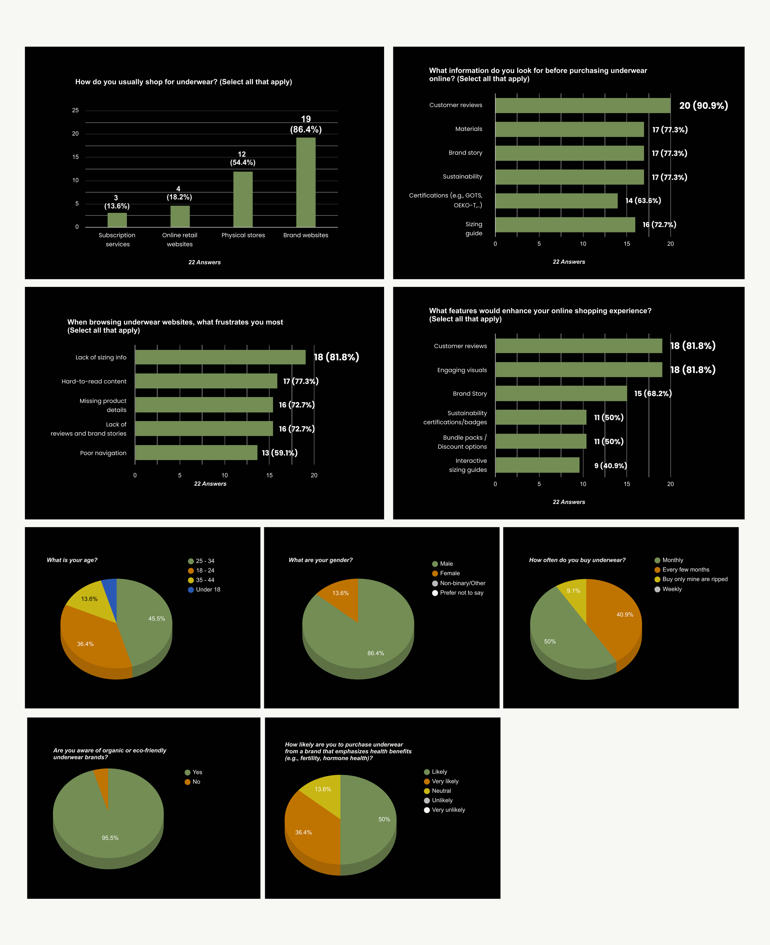
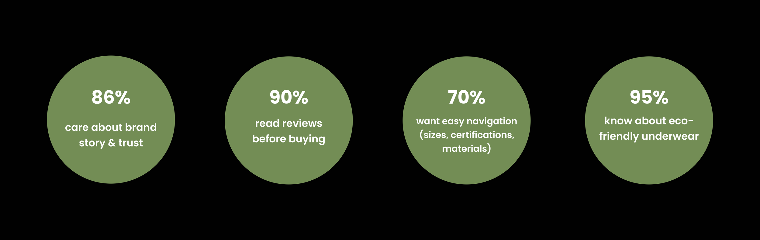
User Pain Points
There were 22 survey responses from a diverse group of individuals across various age ranges, occupations, and genders.
After it, I can conduct that:
User Persona
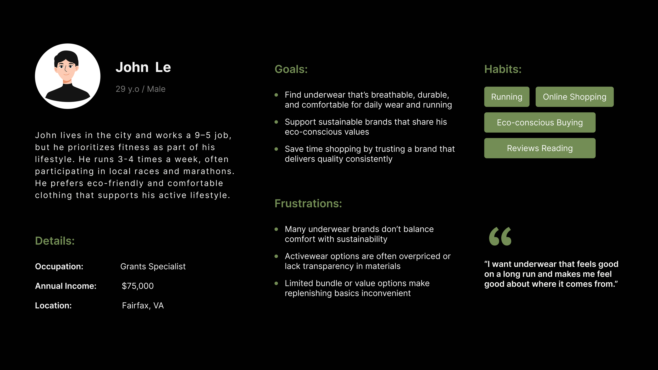
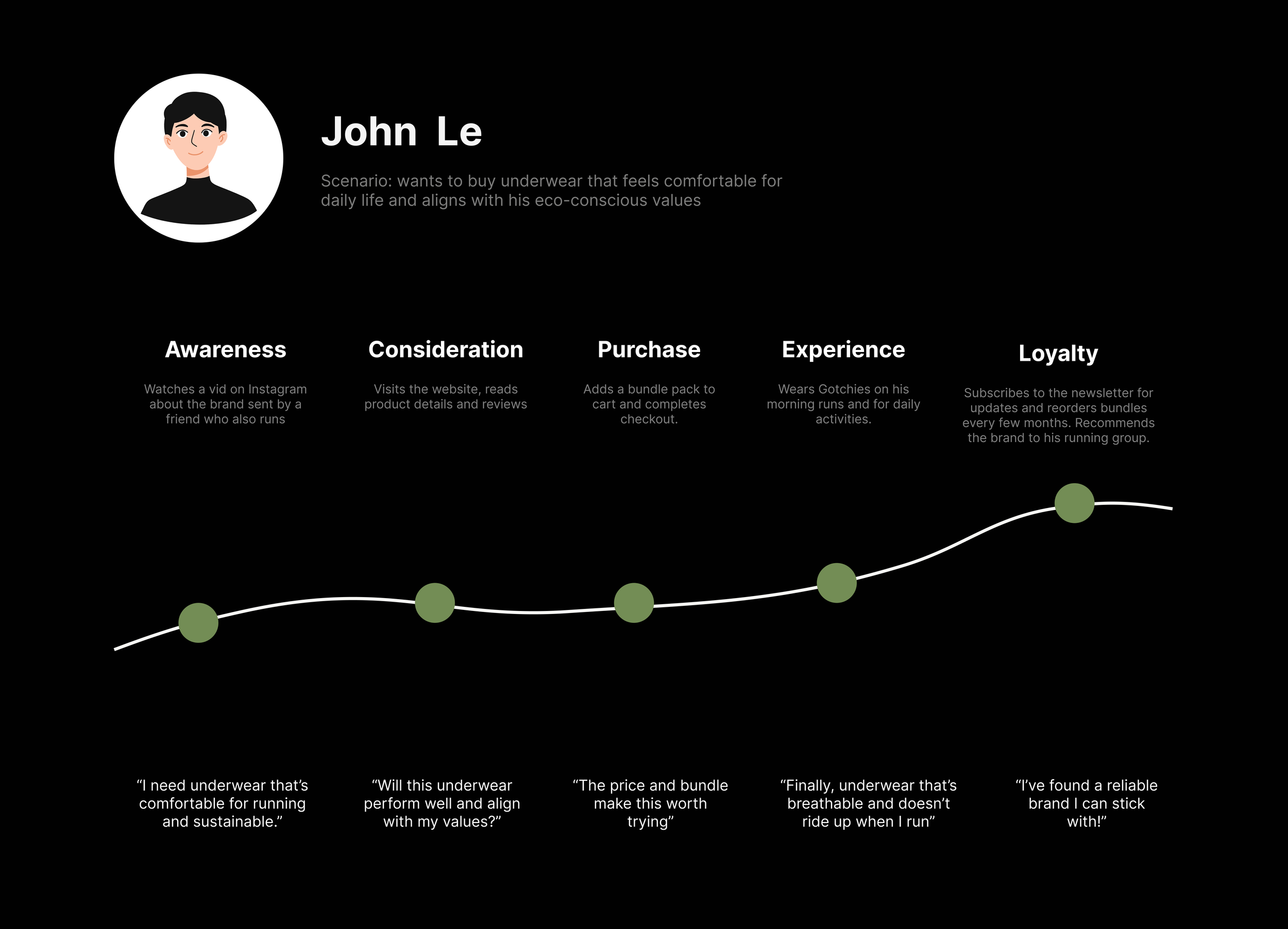
Based on the survey insights I conducted, I created a user persona to represent Gotchies’ primary audience. It paints a clear picture of what users care about most, including their wants, frustrations, and habits. It also serves as a guide for a more focused and effective redesign tailored to their needs.
User Journey
I also created a user journey for John to illustrate his experience from first discovering the product to making a purchase.
This helps identify moments of motivation, potential frustrations, and opportunities to create a smoother, more engaging path for the user.
IDEATIONS
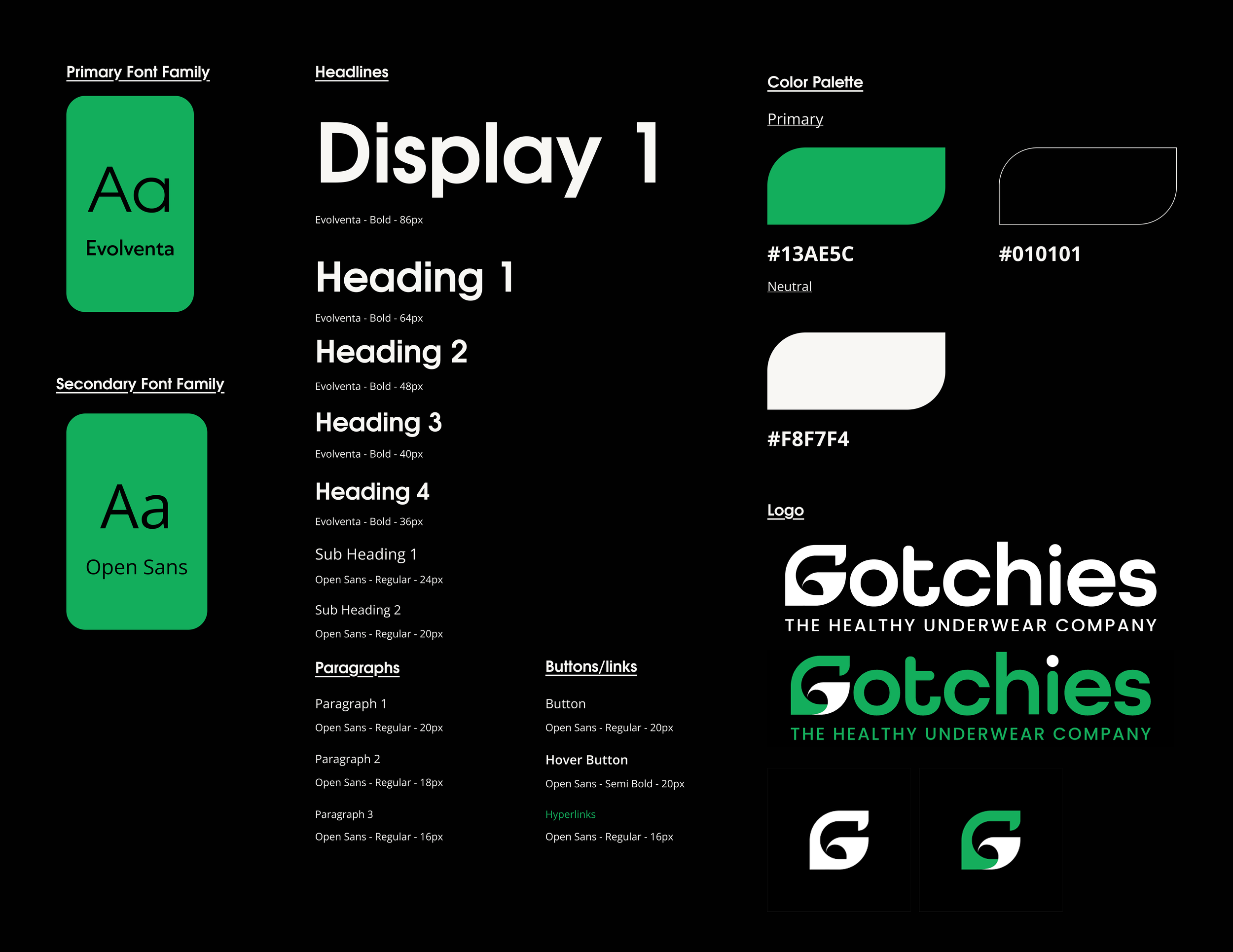
Style Guides
The stakeholders shared that they wanted Gotchies to embody black, white, and green, but they left the tones and typography up to me to capture the right feel.
I chose a vibrant green to represent health and energy, balanced with clean black and white for a modern, confident look.
For the typo, I paired Evolventa’s bold character with the clean readability of Open Sans to create a look that feels both strong and approachable, which matches with Gotchies’ mission of making healthy underwear stylish and accessible.
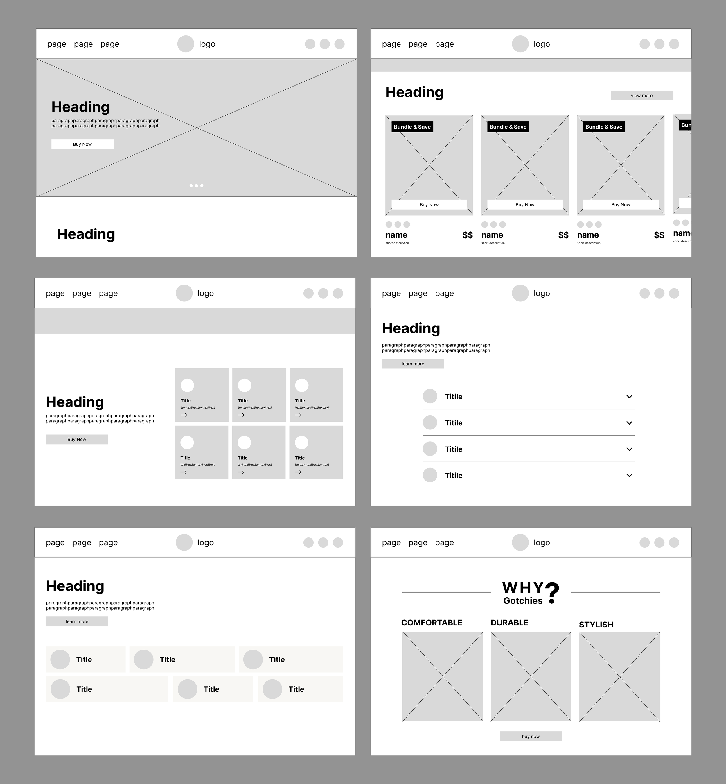
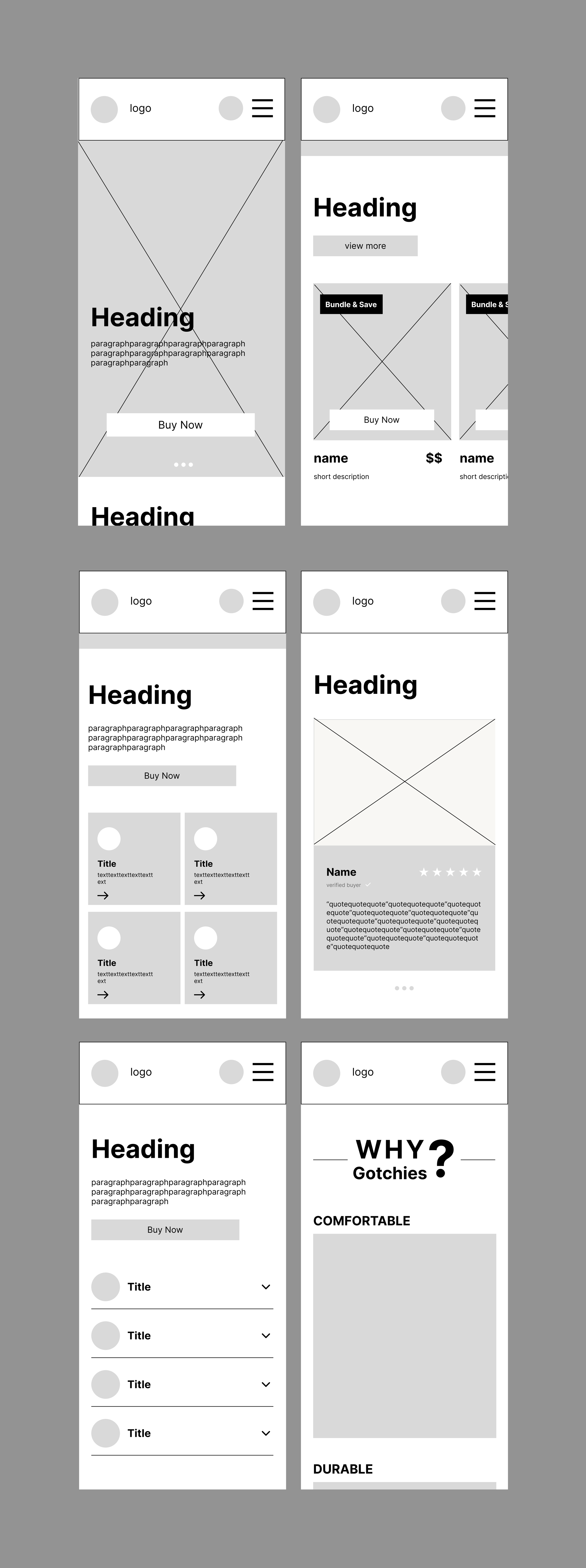
Low-Fidelity Wireframe
I began with low-fidelity wireframes to shape the site’s structure and flow, ensuring the layout felt intuitive and user-focused before moving into visual design. Below are wireframes of the Homepage, Education, and About Us pages, shown in both desktop and mobile versions.
Home (Desktop version)
Home (Mobile version)
Education (Desktop version)
Education (Mobile version)
About Us (Desktop version)
About Us (Mobile version)
Client Feedback
“The layout is easy to navigate and everything feels intuitive. I really like how accessible it is and how the design encourages users to click and explore the product. I can’t wait to see the final launch!”
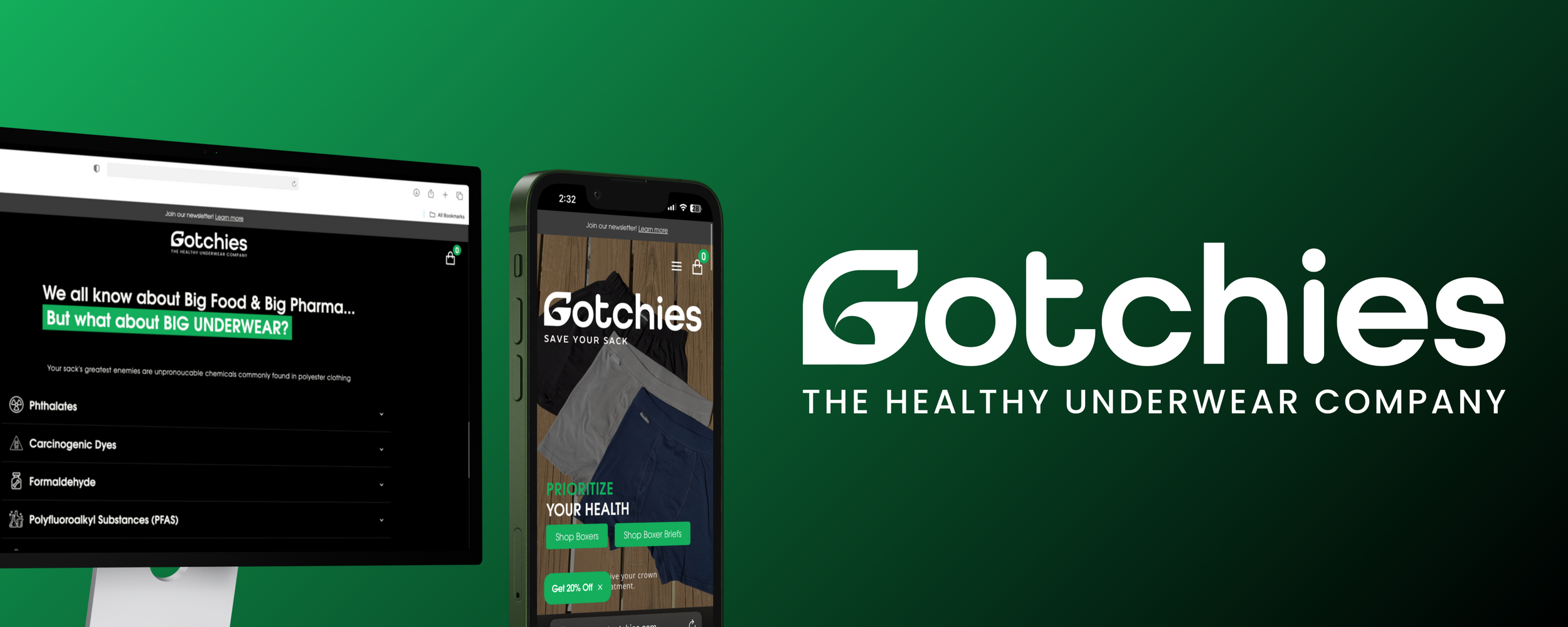
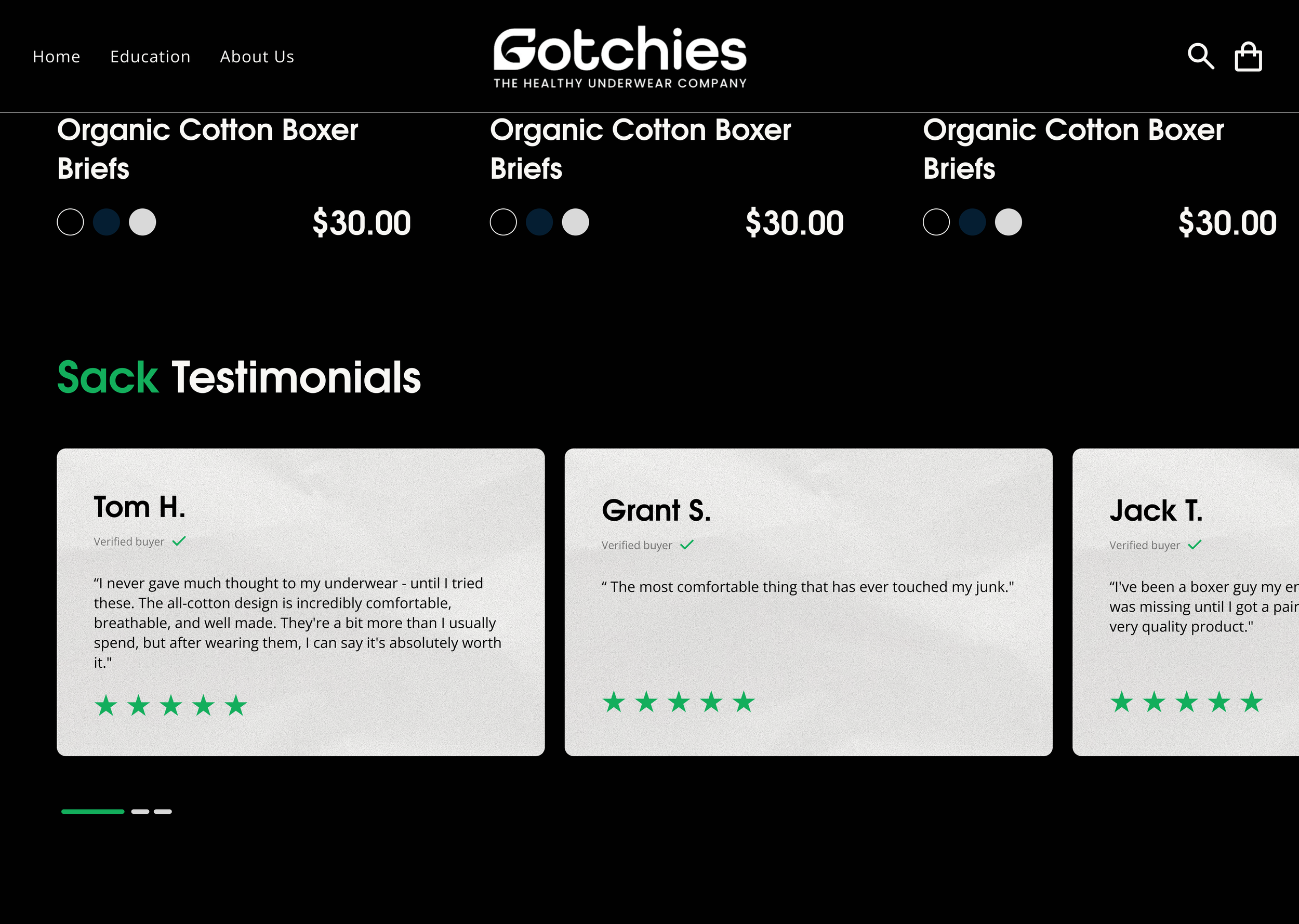
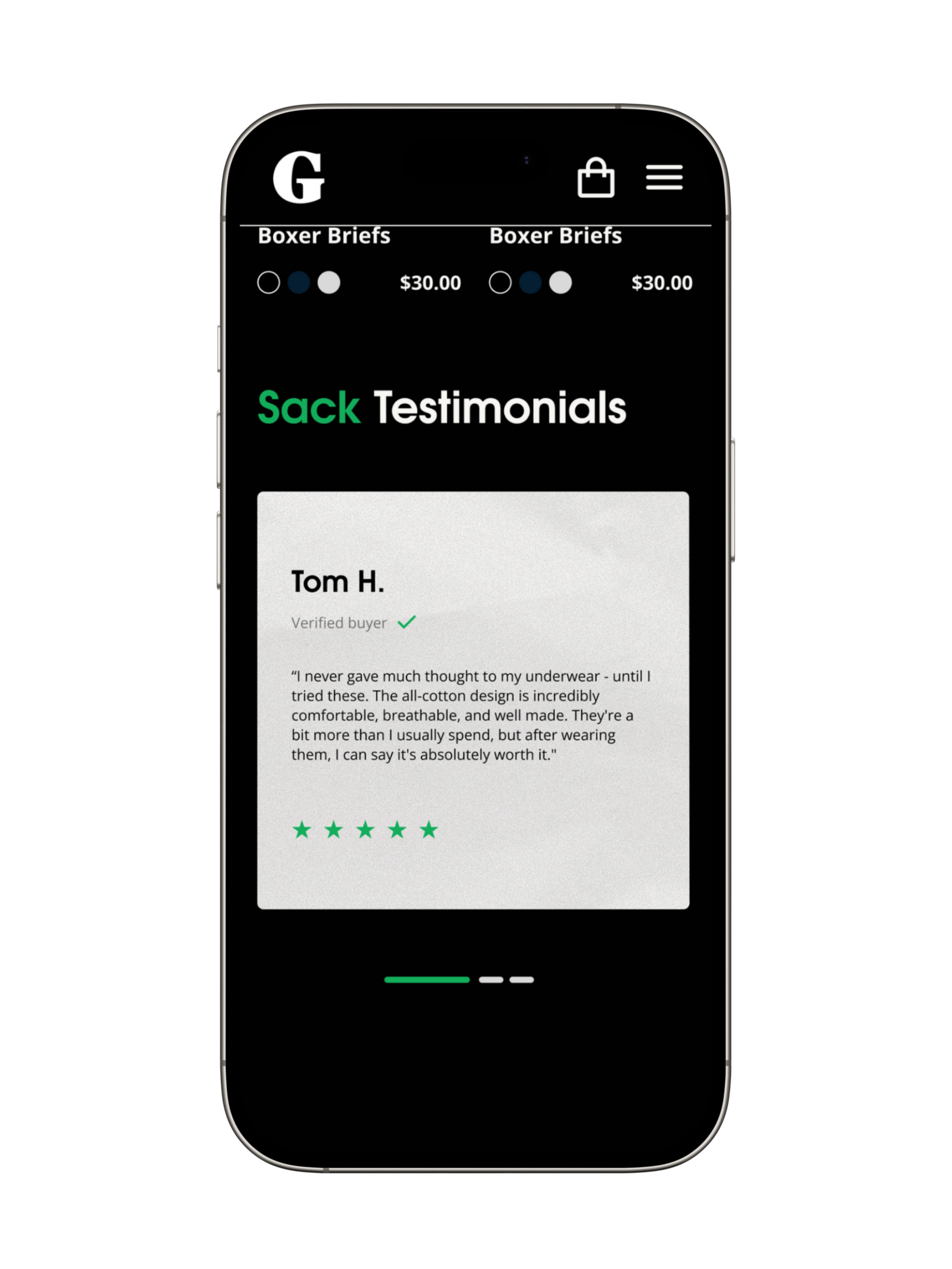
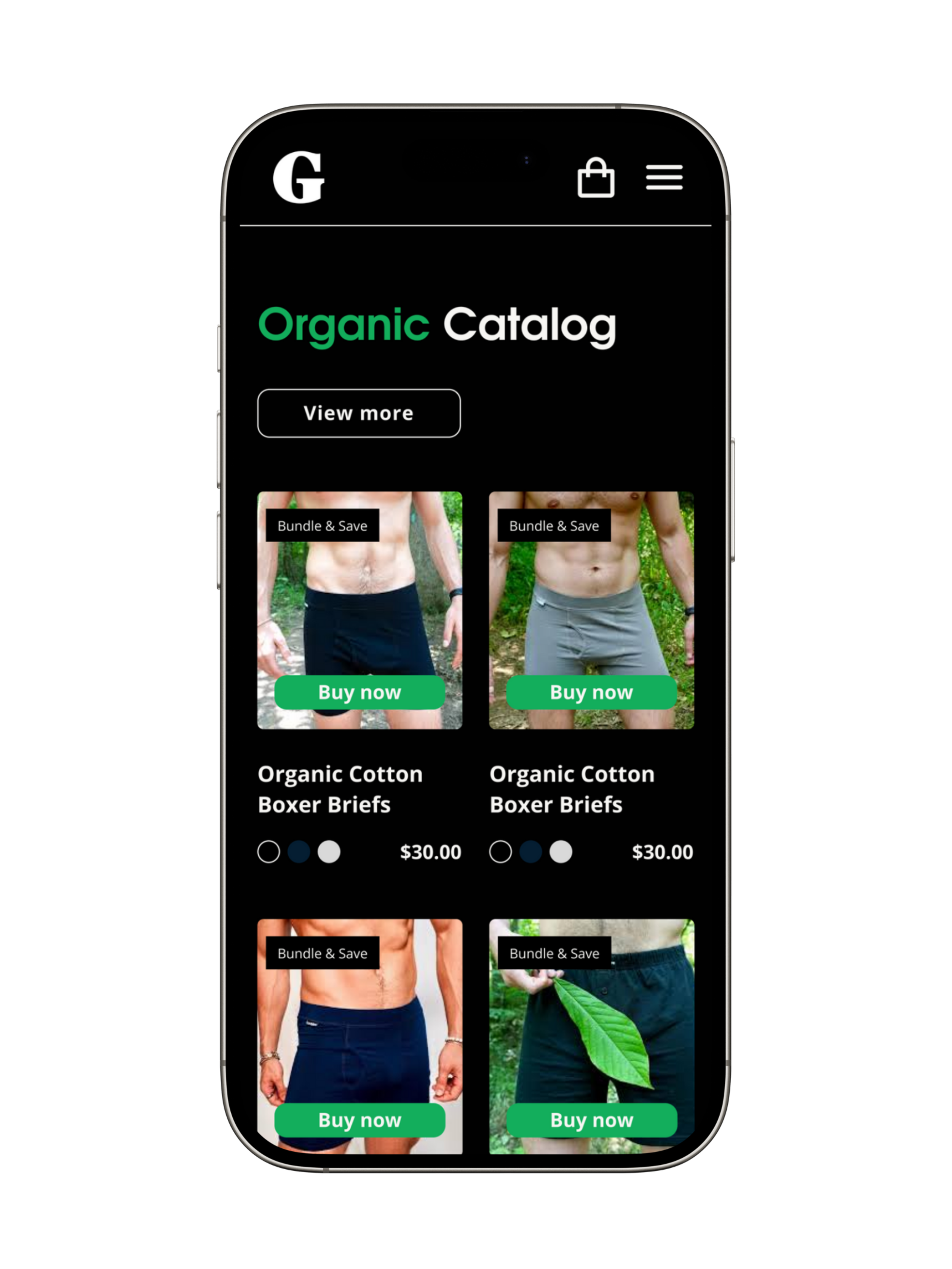
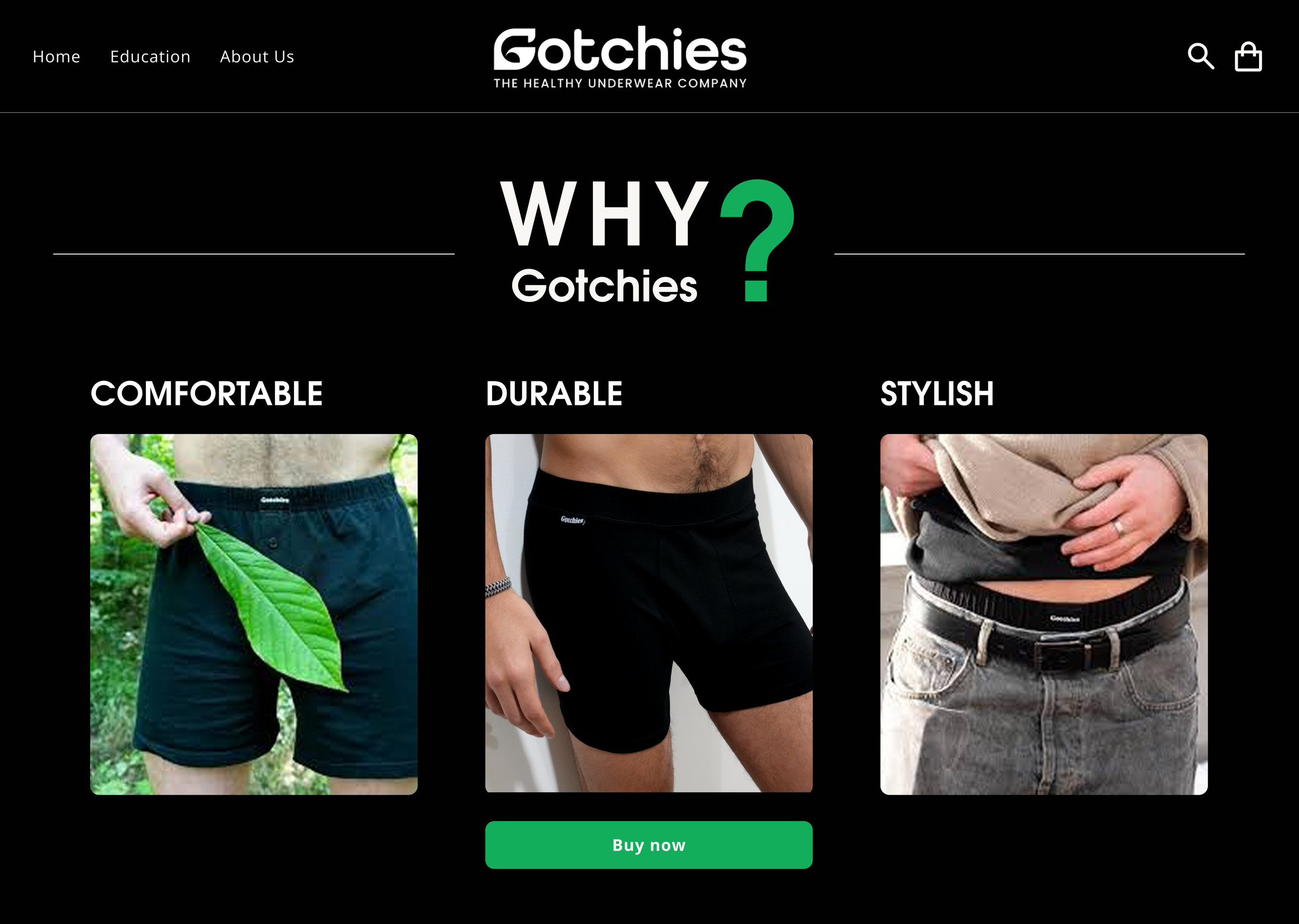
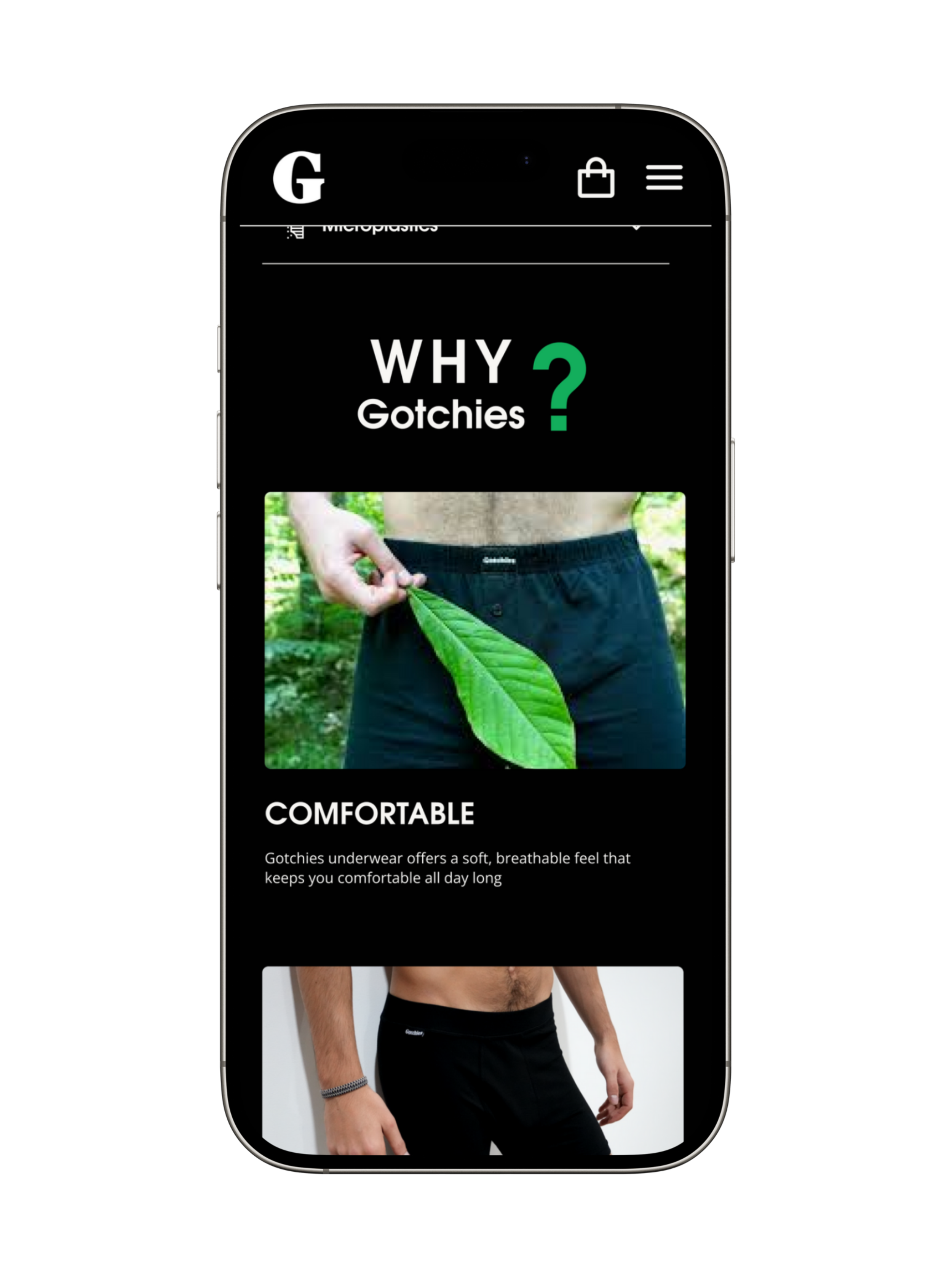
FINAL DESIGN
UI for Launch
After the client reviewed the mid-fidelity wireframe, I got the green light to move forward.
Their excitement about the intuitive layout and product exploration gave me direction and confidence to refine the designs further. I built on that momentum by shaping high-fidelity mockups with colors, typography, and imagery that reflect Gotchies’ eco-friendly and comfort-driven values.
The final touches focused on navigation and call-to-action placement, turning the client’s vision into a modern, approachable website that invites visitors to explore products and shop with confidence.
—Landing page


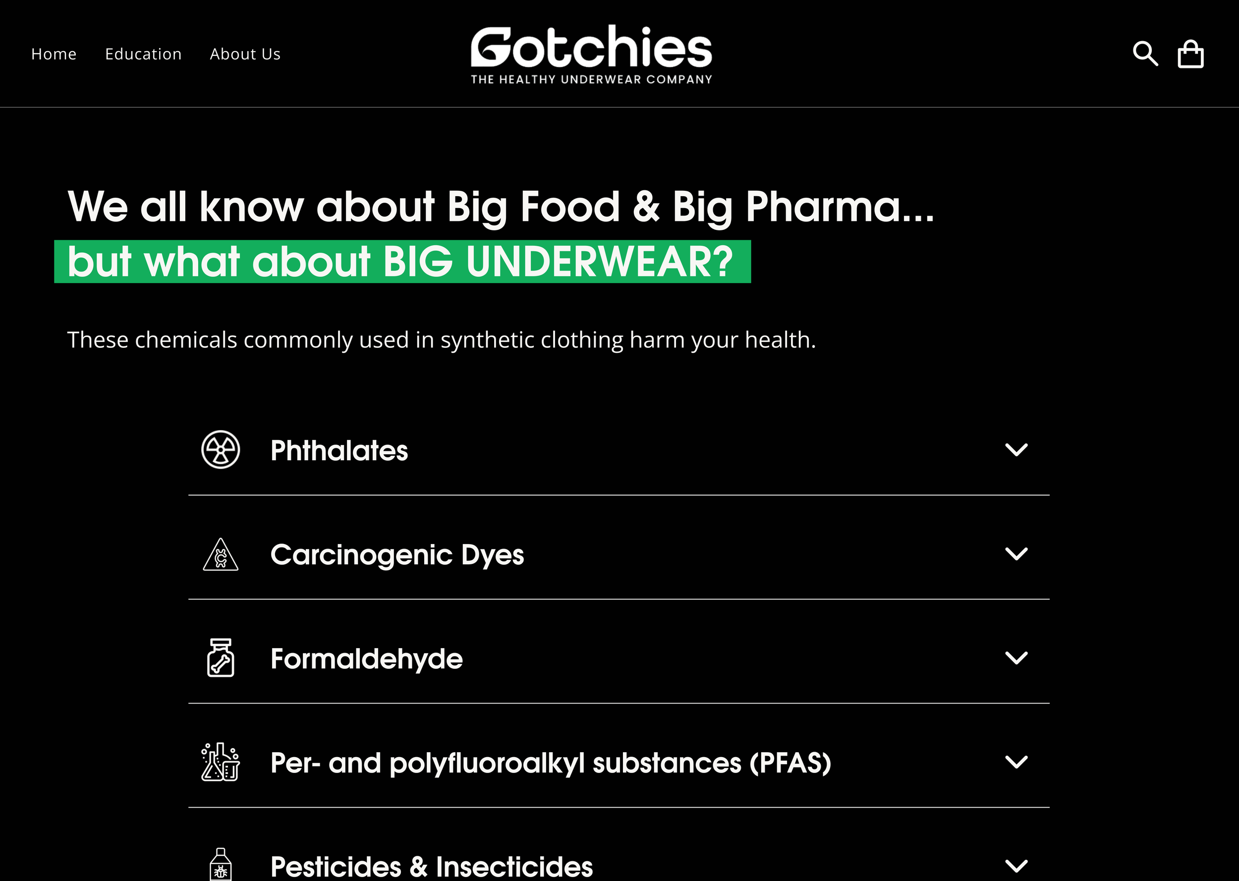
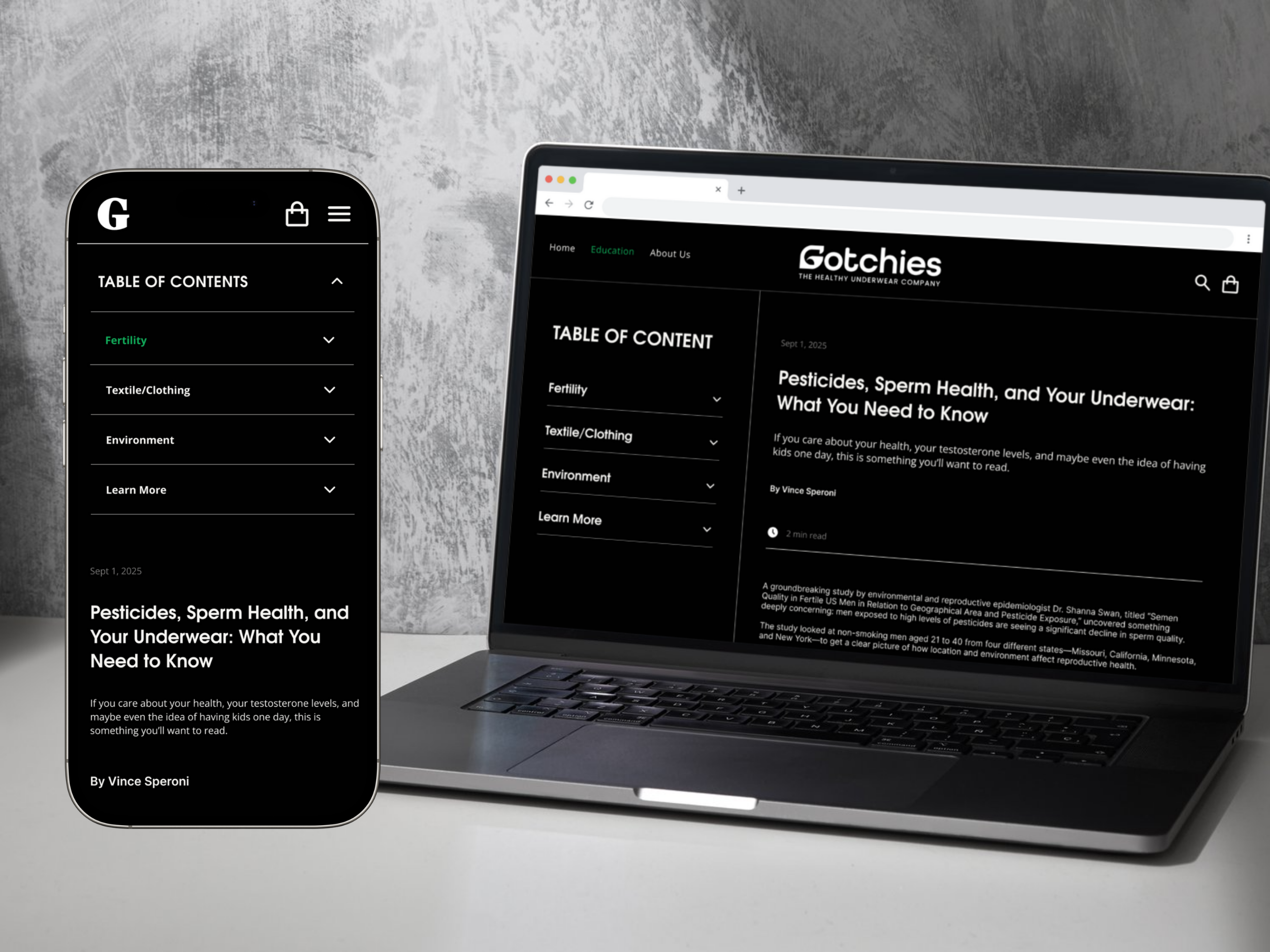
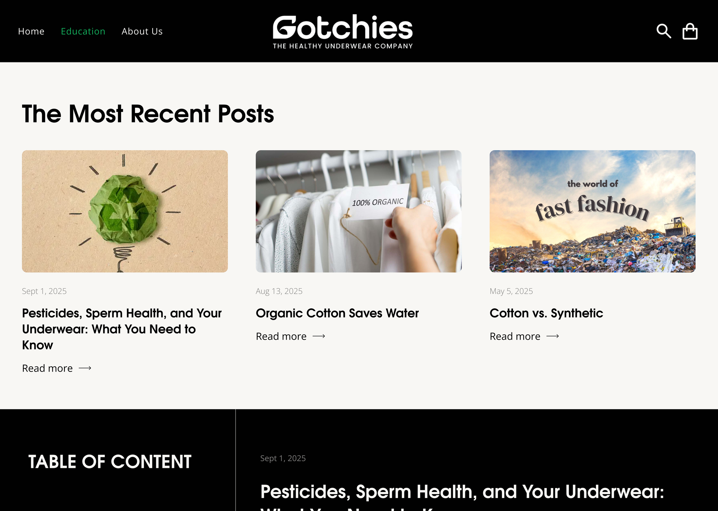
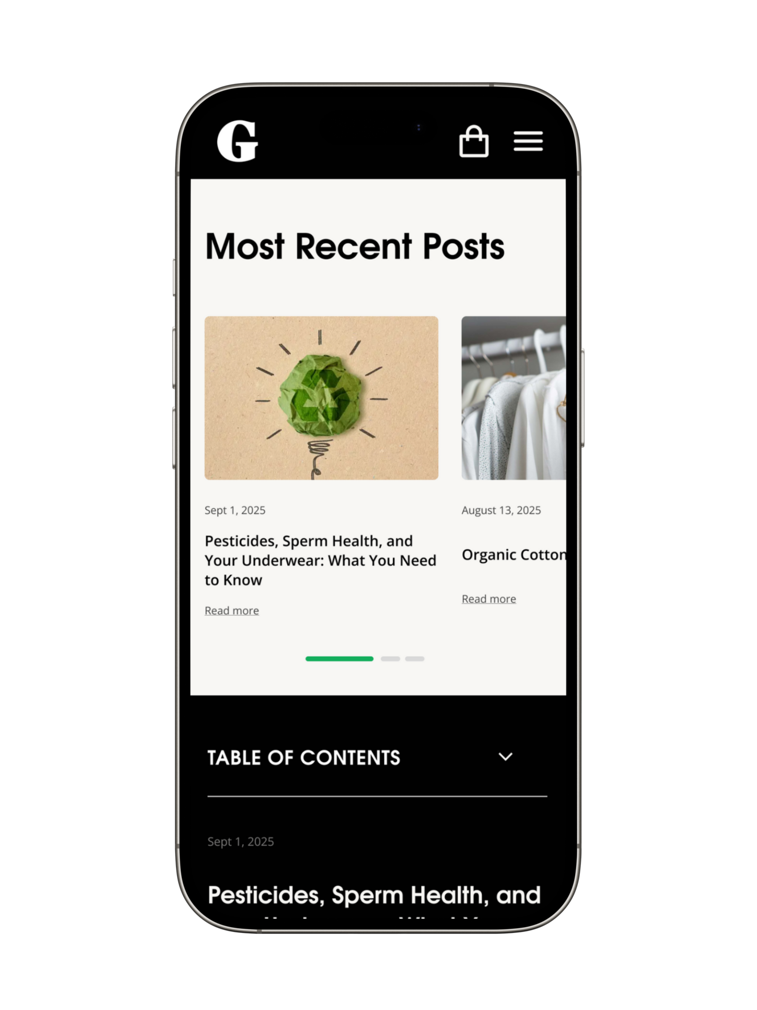
—Education Page
The sidebar was added to make navigation easier for users, allowing quick access to other blogs without losing their place.
In the mobile version, it is fixed at the top, ensuring a smooth experience across devices without overwhelming the screen.
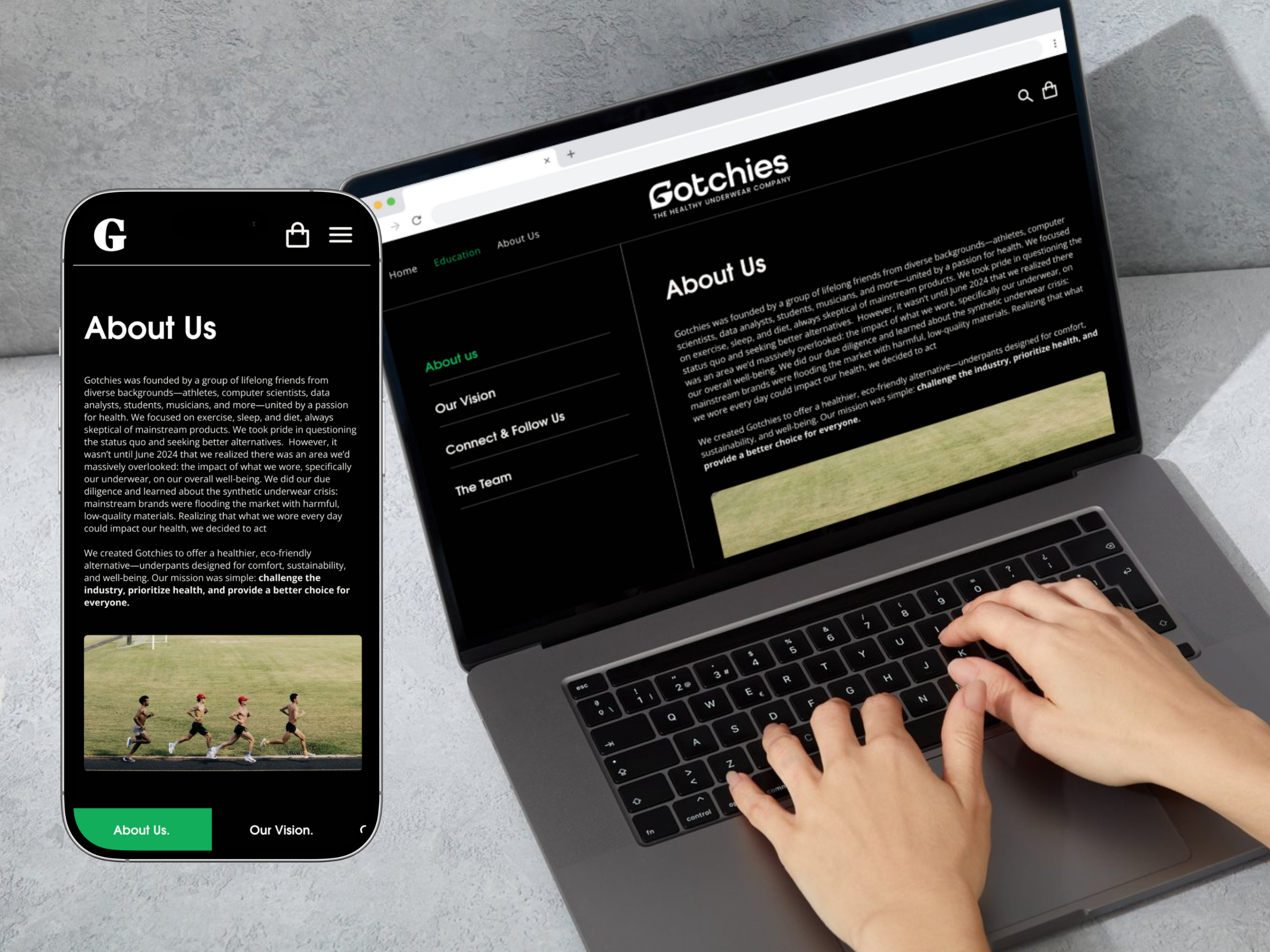
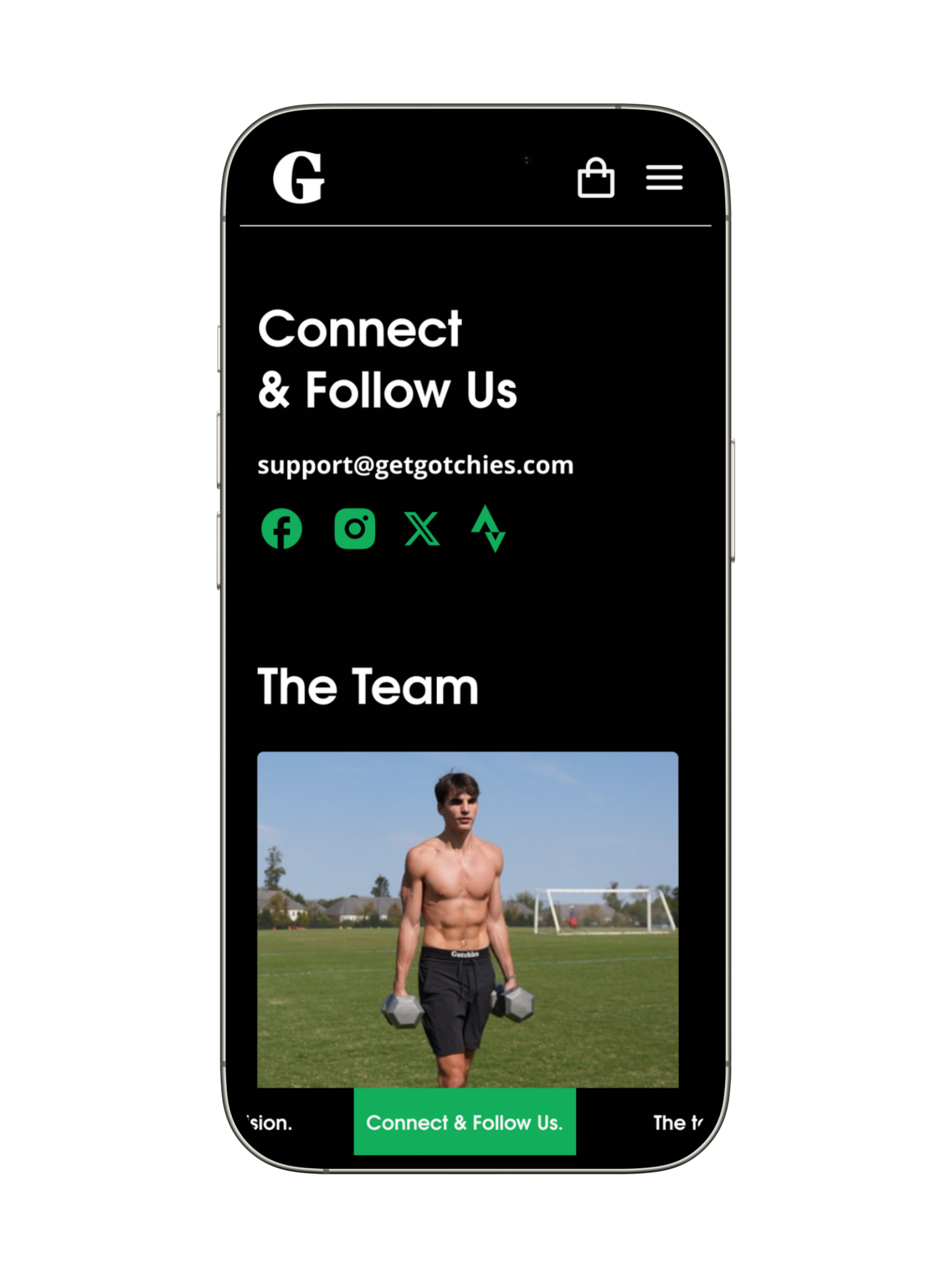
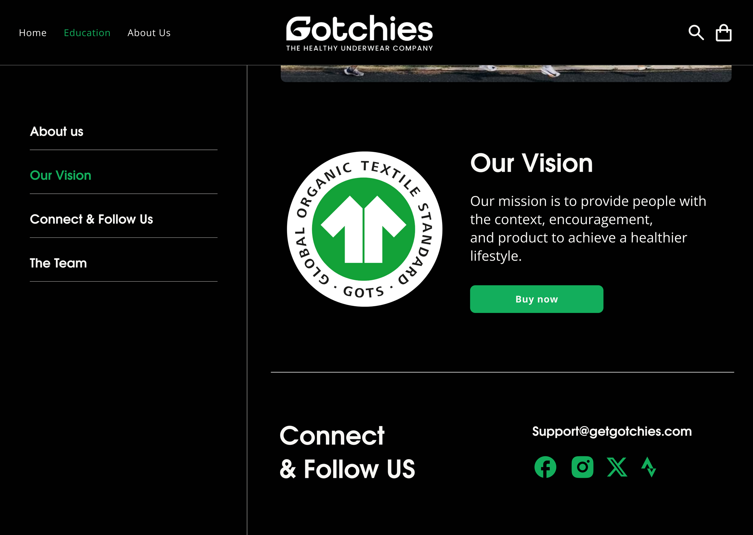
—About Us Page
I also added the sidebar on this page for easier access and quick navigation.
On mobile, it adapts into a fixed bottom bar with horizontal scrolling, keeping the design lightweight while still giving users quick access to content


REFLECTIONA Lasting Impact
After the website was launched, it increased brand awareness by 30%, reduced the time for visitors to click “buy” by 25%, and boosted sales by 15%.
*Please keep in mind that the live website may have been updated since these designs were created, so some elements might look different from what is shown here.
Conclusion
This project was more than just designing a website for a new brand. It was about helping Gotchies share their mission in a way that feels approachable and inspiring. It gave me the opportunity to combine storytelling with user-centered design, creating an experience that supports both the business goals and the values behind the brand. As one of my first big freelancing projects, it also strengthened my ability to listen closely, adapt through feedback, and deliver a solution that makes an impact.